Concept project
goPay
Tap-to-pay wallet that removes decision friction by bringing rewards into the payment moment.
Role: UX Designer
Deliverables: Flow, research, prototype, UI
Focus: Payment clarity, rewards integration, confirmation hierarchy
Problem
Paying with rewards introduces friction at the exact moment speed matters most.
Users switch between payment and rewards apps
Decisions about points or cards slow transactions
Confirmation uncertainty reduces trust
Users wanted convenience and value maximization, but not at the cost of speed.
Design Goal
Create a payment flow where:
The next action is always obvious
Success is unmistakable
Cognitive load is minimized at the terminal
Key Product Decisions
1. Remove decisions at payment moment
Default card preselected
Rewards applied automatically
No branching paths during transaction
Reasoning:
Small purchase contexts require speed over flexibility.
2. Make confirmation explicit and visible
Merchant and amount shown clearly
Immediate success state after tap
Receipt treated as closure, not optional detail
Reasoning:
Trust comes from visibility, not hidden processing.
3. Shift security earlier in the flow
Biometric setup before first transaction
Trust established before payment moment
Reasoning:
Security friction during payment increases hesitation.
Result
The flow brings rewards into the payment moment, reducing decision friction and simplifying user choice.
Core Flows
Two flows showing how hierarchy reduces friction at the moment of payment.
Flow 1: Onboarding to ready-to-pay
Goal: Remove setup hesitation before first transaction.
Screen 1: Value introduction
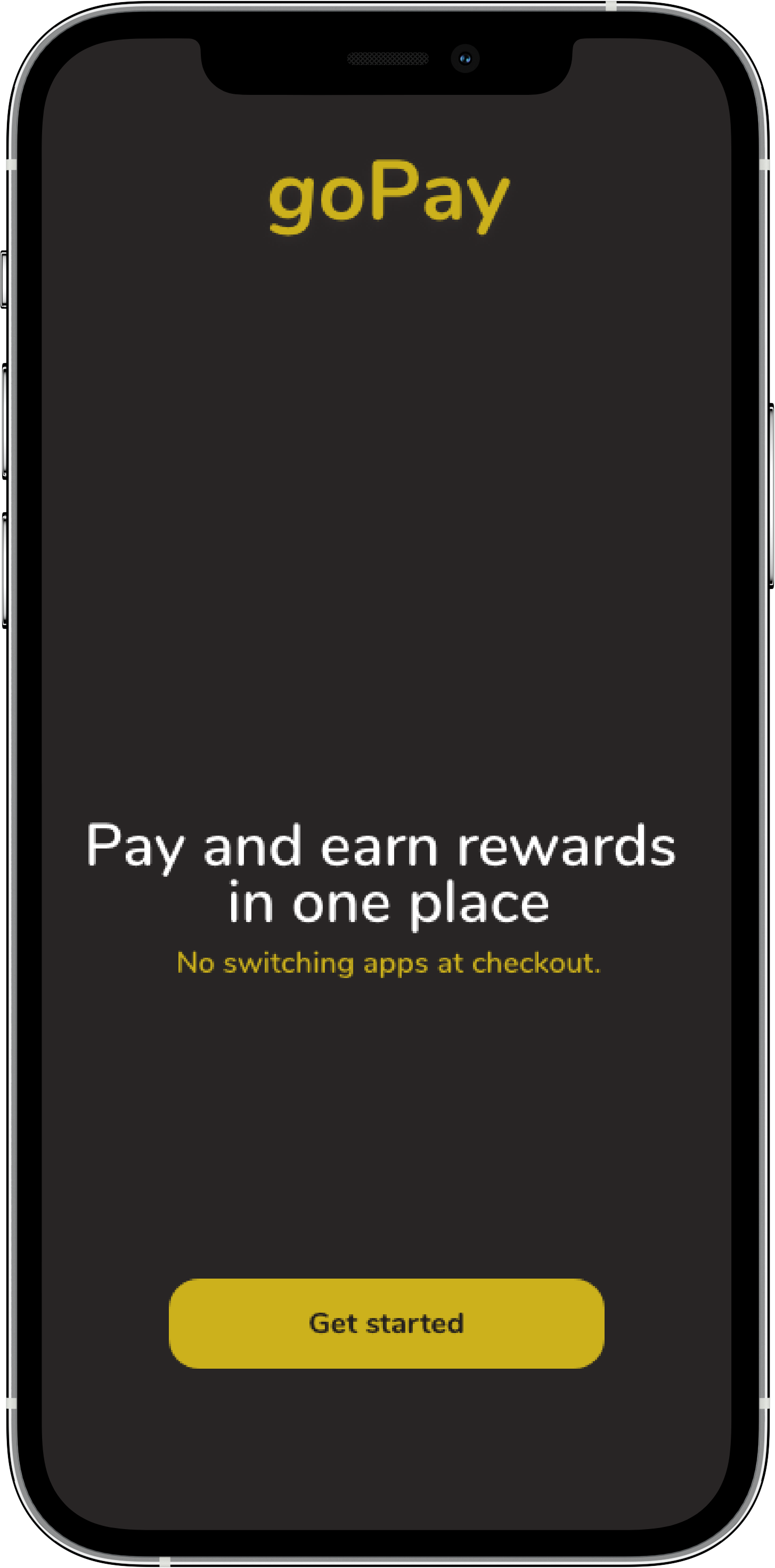
One benefit and one CTA, with rewards positioned as built-in value.
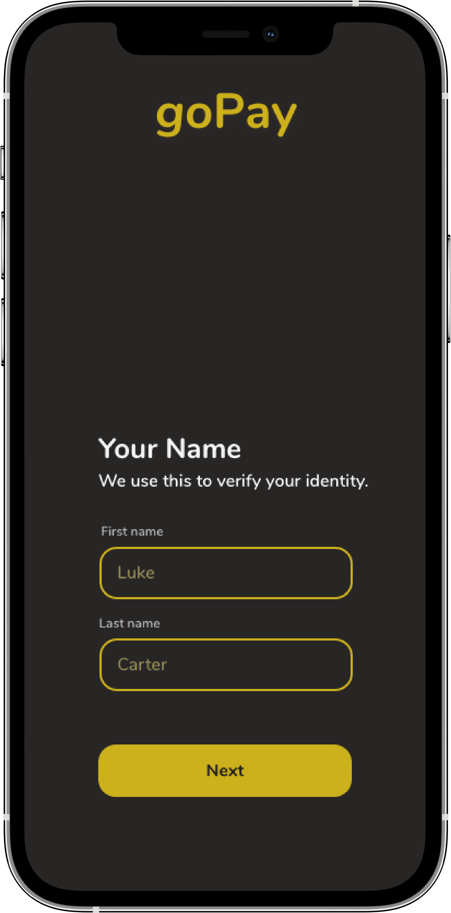
Screen 2: Value introduction
Minimum required fields, with the “why” stated inline to reduce trust friction.
Screen 3: Biometric setup
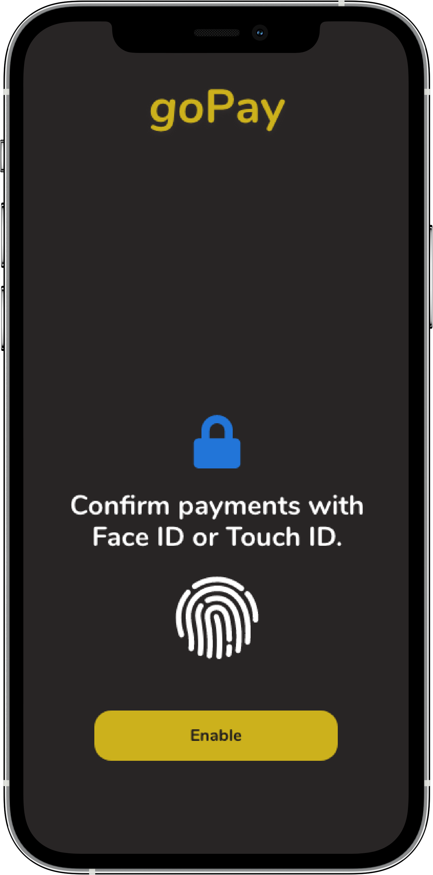
Biometric confirmation introduced early so approval feels predictable at payment
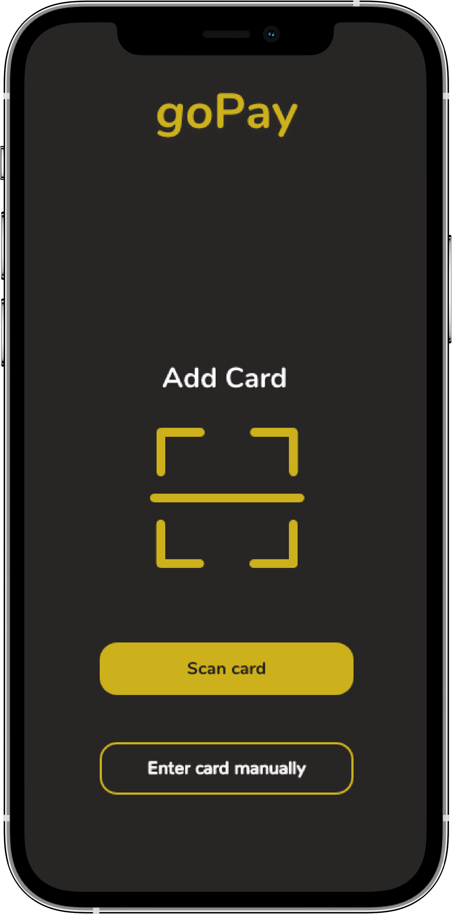
Screen 4: Add payment card
Scan is the primary path, manual entry secondary
Flow 2: Tap to pay with integrated rewards
Goal: Remove friction in decision-making during payment.
Screen 1: Payment ready
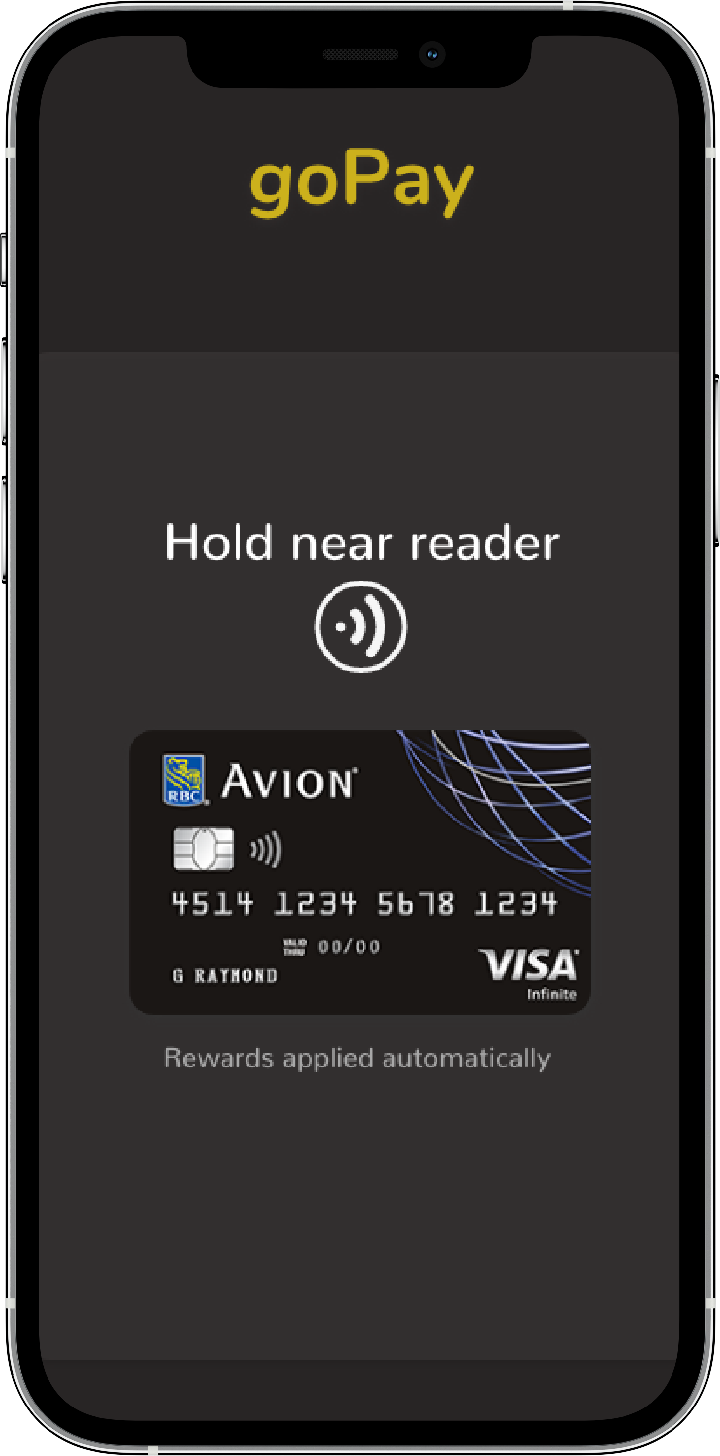
Default payment card already selected. Rewards applied automatically. Device ready to tap.
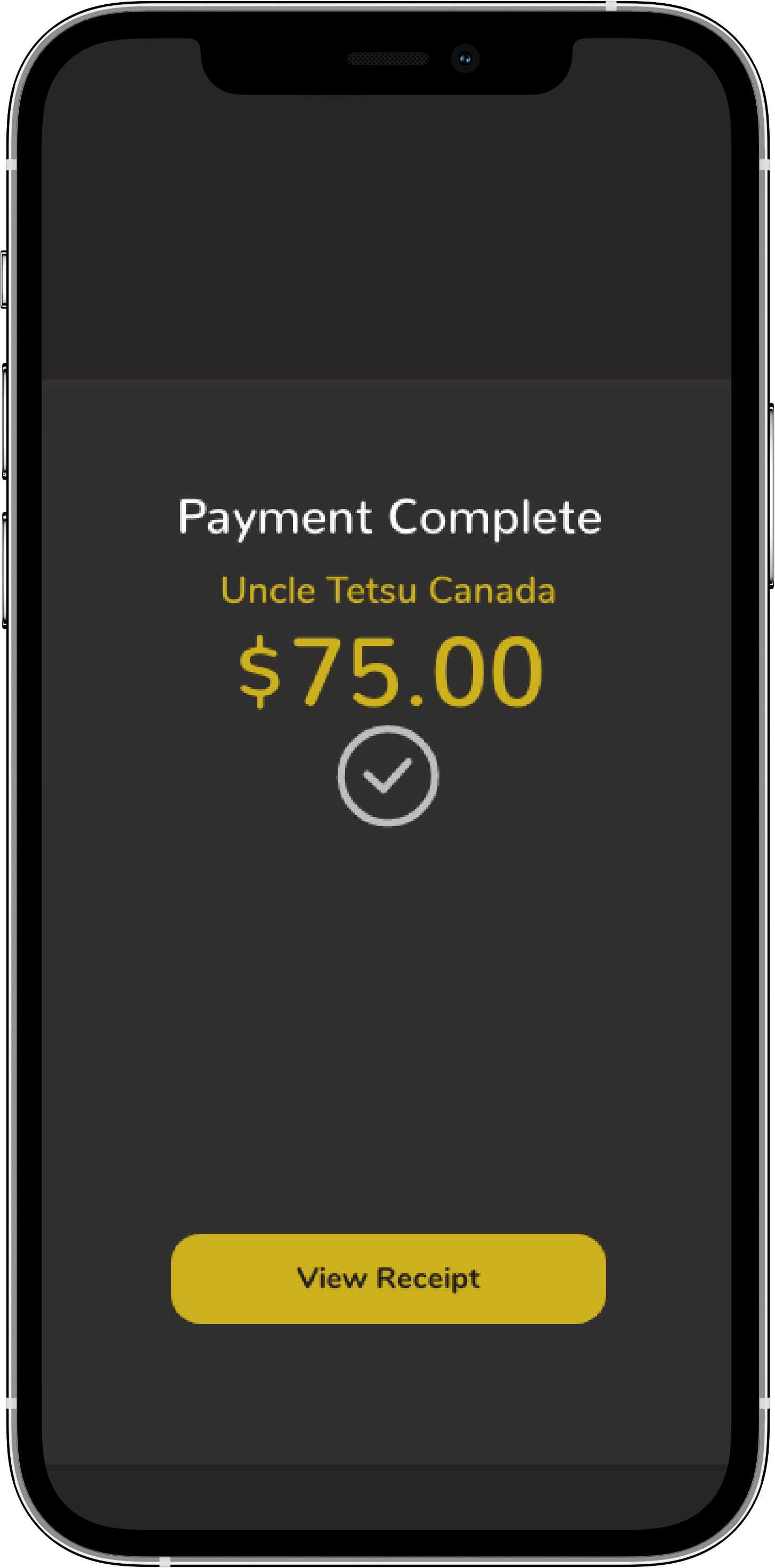
Screen 2: Payment Confirmation
Merchant and final amount clearly displayed.
Immediate success state after tap.
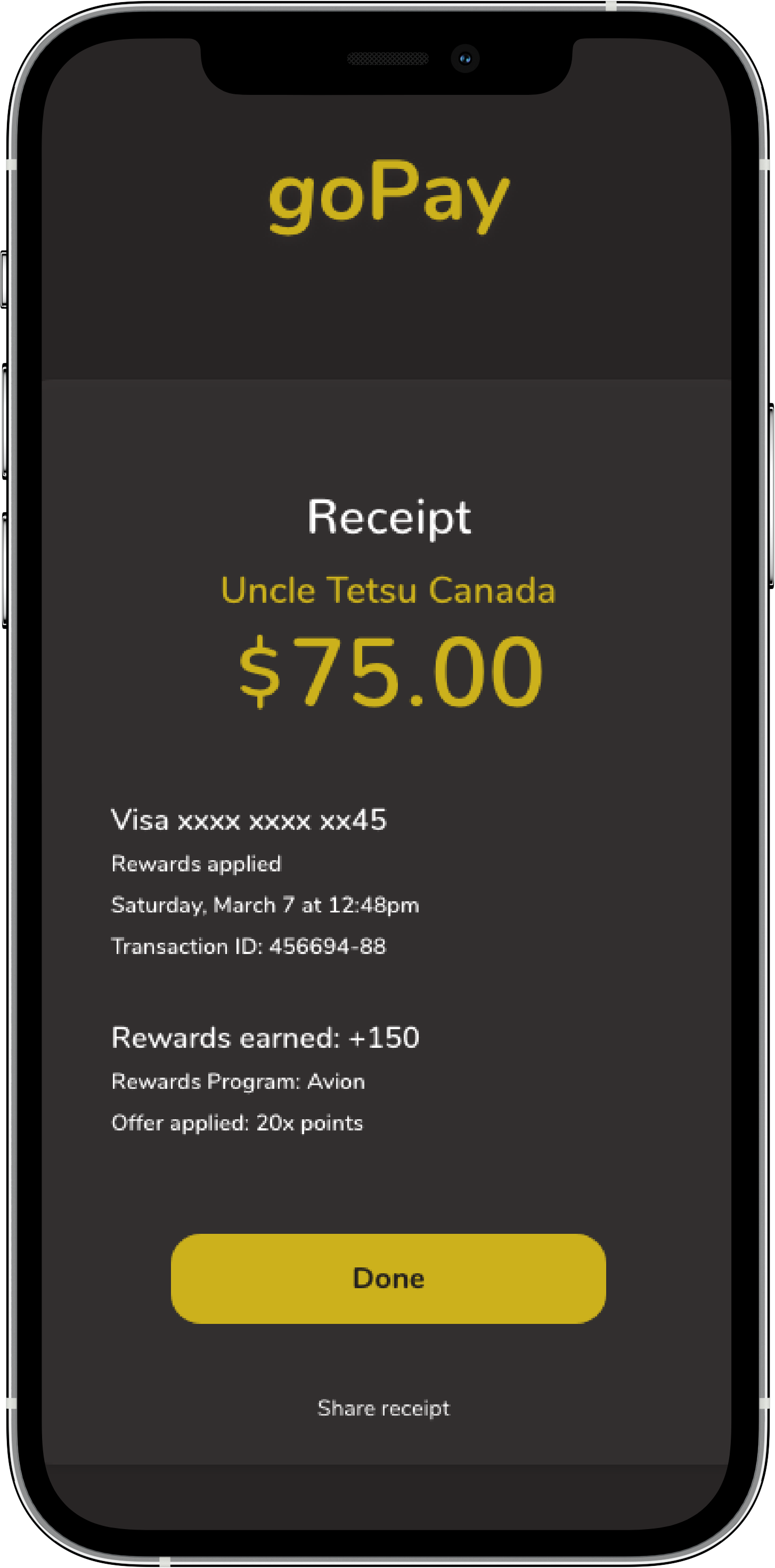
Screen 3: Receipt and transaction details
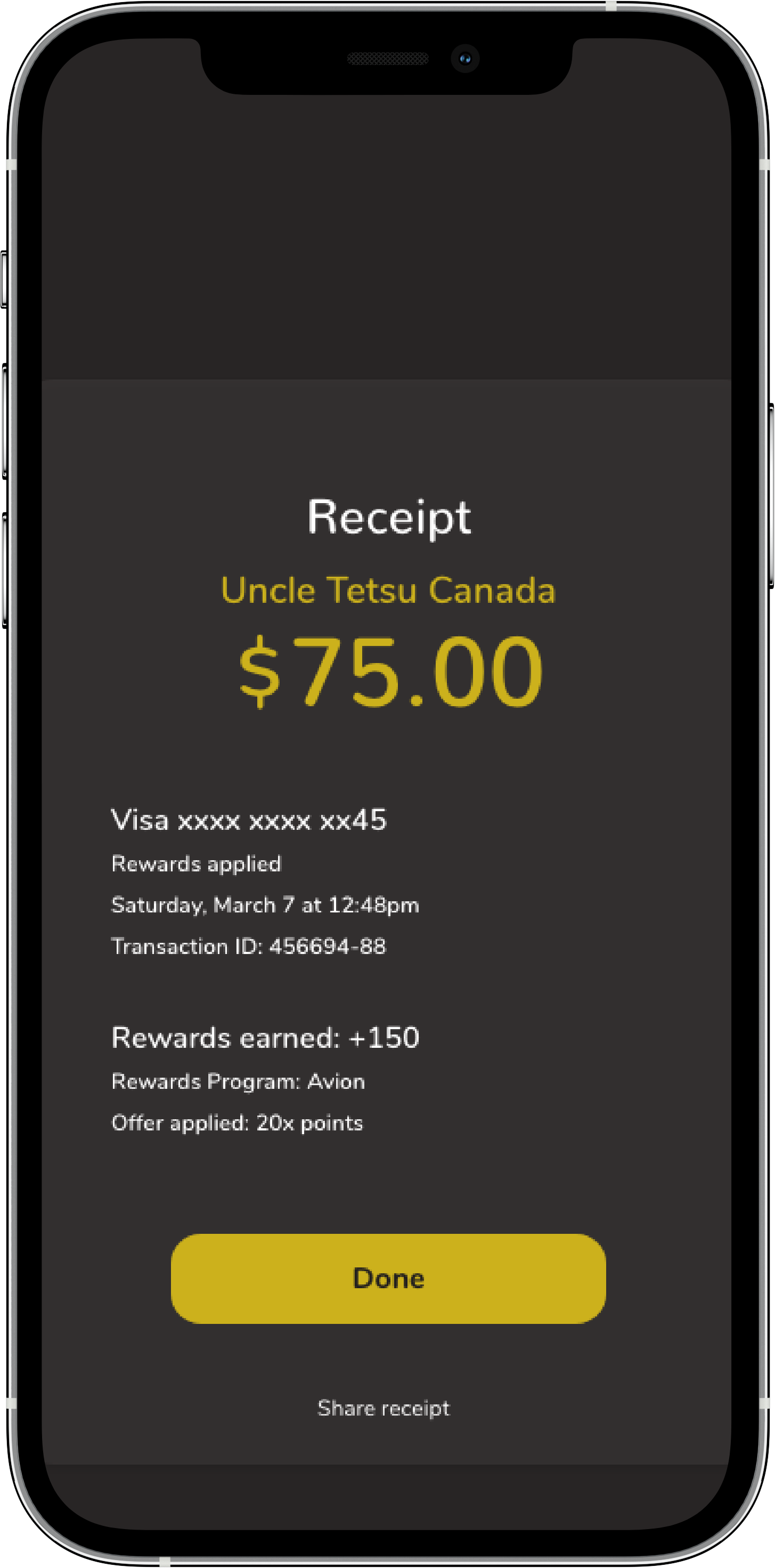
Full transaction details visible.
Receipt treated as closure.
Outcome
The final design reduces friction during payment by simplifying decisions and making transaction outcomes explicit.
• Rewards integrated directly into the payment moment, eliminating the need to switch between apps.
• Default payment method and automatic reward application reduce decision making at the terminal.
• Clear confirmation and receipt screens reinforce trust in the completed transaction.
What I would improve next
• Allow users to toggle automatic rewards application for larger purchases where flexibility may matter more than speed.
• Surface reward balance and earning feedback earlier in the flow to strengthen perceived value.
• Explore smartwatch and quick-access experiences for even faster tap-to-pay interactions.